This article will show you the best Excel charts for data analysis, presentation, and reporting.
You will learn about the various types of charts in Excel, from column charts, bar charts, line charts, and pie charts to stacked area charts.
How to select the best Excel chart?
The type of Excel chart you select for your analysis and reporting depends upon the type of data you want to analyse and report, and what you want to do with the data:
- Visualise data (make sense of data, especially big data).
- Classify and categorise data.
- Find a relationship among the data.
- Understand the composition of data.
- Understand the distribution of data.
- Understand the overlapping of data.
- Determine patterns and trends.
- Detect outliers and other anomalies in data.
- Predict future trends.
- Tell meaningful and engaging stories to decision-makers.
What are the most popular Excel charts and graphs types?
The following are the most popular Excel charts and graphs:
- Line chart.
- Clustered Column Chart.
- Combination chart.
- Stacked column chart.
- 100% stacked column chart.
- Stacked area chart.
- Bar chart.
- Pie chart.
- Number chart.
- Gauge chart (Speedometer chart).
- Scatter chart.
- Histogram.
- Actual vs target chart.
- Bullet chart.
- Funnel chart.
- Venn diagram.
- Sankey diagram.

When to use a Line chart?
The following are the various scenarios where a line chart can be particularly helpful:
- Tracking trends over time.
- Handling many data points.
- The order of categories is important.
- Emphasising changes between two variables.
- Spotting small changes or variations.
- Highlighting anomalies or outliers.
- Forecasting future trends.
- Showing rate of change.
- Time series analysis.
- Budget tracking.
- Performance analysis over specific intervals.
#1 Tracking trends over time.
Use a line chart to observe trends (like uptrend, downtrend, short-term trend, sideways trend, long-term) over a period.
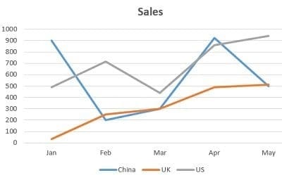
Start by understanding what each axis represents.
Then, look at the trend of the line – whether it rises, falls, or stays consistent – to interpret the changes in data over time.
Line charts are great for showing long-term changes, such as trends over several months or years.
In a line chart, the axes are crucial in presenting the data.
The horizontal axis (x-axis) usually represents categories or time periods, while the vertical axis (y-axis) shows the values you’re measuring.
The relationship between these two axes allows a line chart to effectively display how one variable (the values on the y-axis) changes in relation to another (the categories or time periods on the x-axis).
This makes line charts particularly useful for tracking changes and trends over time.
#2 Handling many data points.
If you have many data points, a line chart can display them without looking cluttered, unlike bar or column charts, which might seem too crowded.
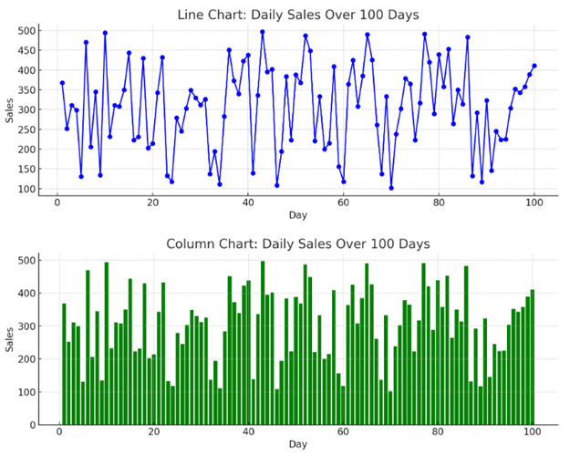
#3 Order of categories is important.
Use a line chart rather than a clustered column chart if the order of the categories is important.
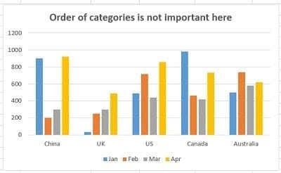
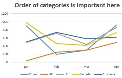
For example, if you want to show progress or changes over time, the line chart helps maintain chronological order.
#4 Emphasising changes between two variables.
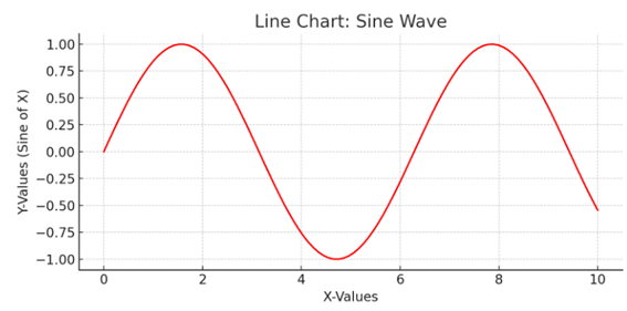
Line charts are perfect when you want to highlight how one variable changes in relation to another.
The changes are plotted on the vertical axis against the horizontal axis.
Here’s a line chart that illustrates how one variable (Y-Values, the sine of X) changes in relation to another variable (X-Values).
#5 Spotting small changes or variations.
Line charts are excellent for displaying data with small variations that might not be as noticeable in other chart types.
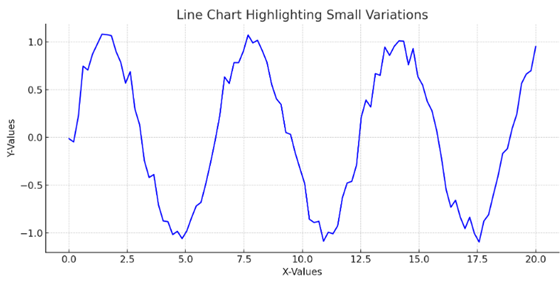
The chart shows Y-values that vary slightly around a sine wave pattern, plotted against X-values.
The line chart’s continuous nature makes it easier to spot these minor fluctuations, which could be lost or less apparent in other charts, like bar or column charts.
This demonstrates the effectiveness of line charts in revealing subtle changes and variations in data.
#6 Highlighting anomalies or outliers.
Line charts can help spot unusual data points. If a line suddenly spikes or drops, it can indicate something significant, like a sudden increase in website traffic.
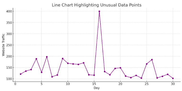
The line chart displayed above is designed to help spot unusual data points. It represents website traffic over 30 days.
On the 16th day, there’s a noticeable spike in traffic, which stands out distinctly against the otherwise consistent traffic levels.
The sudden increase in the chart can indicate something significant, such as a successful marketing campaign, a viral post, or other events that drive increased website visits.
This example illustrates how line charts effectively highlight anomalies and unusual occurrences in datasets, enabling quick identification of significant changes or events.
#7 Forecasting future trends.
Line charts can be used for predictive analysis. By extending the line, you can forecast future trends based on past data.
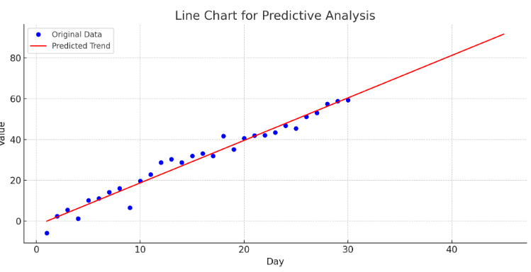
The line chart shown above is designed for predictive analysis. It features original data (in blue) that follows a linear trend over 30 days.
Using this data, a linear regression model has been trained to forecast future trends. The model’s predictions are extended to 45 days and depicted in red on the chart.
The extended red line demonstrates the forecasted trend based on past data, visually representing expected future values.
This kind of analysis is useful for various applications, such as predicting sales, website traffic, or stock prices based on historical trends.
The chart effectively illustrates how extending the trend line in predictive models can help forecast future trends.
#8 Showing rate of change.
Line charts are useful for illustrating the rate at which something changes.
For example, a steep line indicates a rapid change, while a gradual slope shows a slower change.
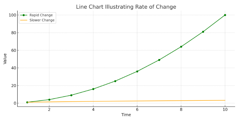
The line chart above illustrates the rate of change for two different growth types.
The green line represents a rapid change, as shown by a quadratic function (value = time²), which increases steeply over time. This steep incline indicates a rapid rate of change.
In contrast, the orange line represents a slower change, modelled by a square root function (value = √time).
This line has a more gradual slope, indicating a slower rate of change over the same time period.
This visualisation effectively demonstrates how the steepness of a line in a chart can indicate the rate of change: steeper lines suggest faster changes.
At the same time, more gradual slopes indicate slower changes.
This is a fundamental concept in interpreting line charts, particularly in fields like economics, science, and engineering, where understanding the rate of change is crucial.
#9 Time series analysis.
Line charts are essential for time series analysis, where you track the same variable over regular intervals, like daily temperature readings or monthly sales figures.
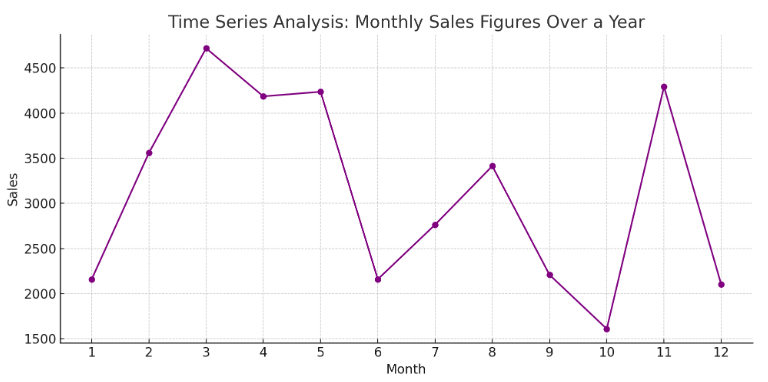
The line chart above is designed for time series analysis and depicts monthly sales figures over a year.
Each point on the chart represents sales data for a specific month, with the months on the horizontal axis and the corresponding sales figures on the vertical axis.
The connected points form a line that makes it easy to follow the sales trend throughout the year.
This type of visualisation is particularly useful for identifying patterns, such as seasonal fluctuations or unusual spikes or dips in sales.
Time series analysis like this is essential in many fields for tracking changes in variables over time and making informed decisions based on those trends.
#10 Budget tracking.
Line charts can track expenses or revenues against a budget over time, helping quickly identify areas above or below the budget.
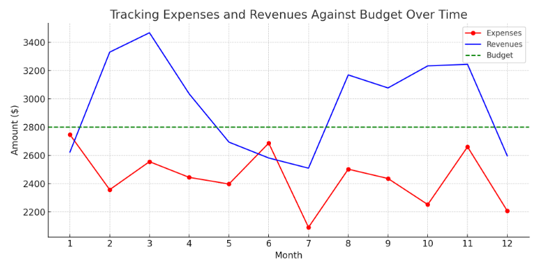
The above line chart tracks monthly expenses and revenues against a yearly budget.
The red line represents monthly expenses, and the blue line represents monthly revenues.
The green-dashed line indicates the set budget for each month.
This visualisation quickly assesses how expenses and revenues compare to the budget over time.
It’s easy to identify months where expenses exceed or fall below the budget and how revenues stand in relation to the budgeted amount.
Such a chart is particularly useful in financial management, providing a clear visual representation of fiscal health and highlighting areas needing attention or adjustment.
#11 Performance analysis over specific intervals.
Line charts are great for comparing performance across different intervals, such as quarterly sales or academic scores year over year.
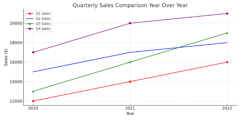
The line chart above compares quarterly sales figures year over year. It includes data for four quarters (Q1, Q2, Q3, and Q4) across three years (2020, 2021, and 2022).
Each line represents the sales figures for a specific quarter across the different years, with distinct markers and colours for clarity.
This visualisation makes it easy to compare the performance of each quarter year over year.
You can quickly see trends, such as which quarters showed growth or decline over the years.
This type of analysis is particularly valuable in business for assessing seasonal performance, planning future strategies, and understanding historical sales patterns.

When to use a Clustered column chart?
The following are the various scenarios where a clustered column chart can be particularly helpful:
- Comparing multiple data series.
- Suitable for comparative analysis.
- Consistent units of measurement.
- Comparable data sizes.
- Displaying extremes.
- Focus on short-term trends.
- The order of categories is not important.
- Comparing subcategories within a main category.
- Visualising part-to-whole relationships.
- Evaluating performance across different groups.
- Presenting survey results.
#1 Comparing multiple data series.
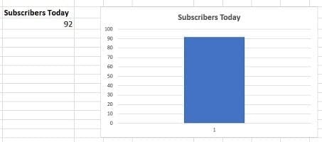
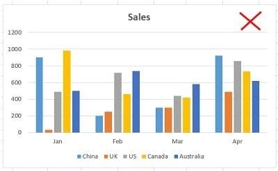
A clustered column chart is ideal for comparing 2 to 4 data series. Avoid using it for just one series or more than four, as it can get cluttered.
Following is an example of a clustered column chart with just one data series:
The following chart contains just five data series, and it has already started looking cluttered:
The chart below contains 11 data series and is very difficult to read and understand:

If you want to create a column chart that contains a lot of data series, then you can try switching ‘row’ and ‘column’ of the chart and see whether it makes any difference:
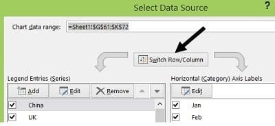
For example, after switching the row and column of the chart (with 11 data series), it looks like the one below:
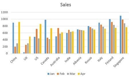
Though it still looks cluttered, this chart is much easier to read and understand.
#2 Suitable for comparative analysis.
Unlike a simple column chart, which represents a single variable, clustered column charts display multiple data variables, making them suitable for comparative analysis.
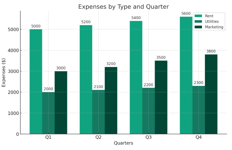
This chart compares different types of expenses (rent, utilities, marketing) over four quarters (q1, q2, q3, q4).
Each group of bars represents a quarter, with individual bars showing the expenses for each category within that quarter.
This layout makes it easy to compare how each type of expense changes from quarter to quarter.
#3 Consistent units of measurement.
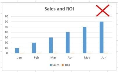
Use a clustered column chart when the data series you want to compare has the same unit of measurement.
So, avoid using column charts that compare data series with different units of measurement.
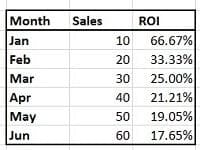
For example, in the chart below, ‘Sales’ and ‘ROI’ have different units of measurement.
The data series ‘Sales’ is of type number. Whereas the data series ‘ROI’ is of type percentage:
#4 Comparable data sizes.
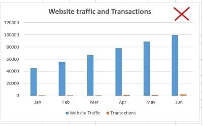
Use a clustered column chart when the data series you want to compare are of comparable sizes.
If the values of one data series dwarf those of the other, do not use a column chart.
For example, in the chart below, the values of the data series ‘Website Traffic’ completely dwarf the values of the data series named ‘Transactions’:
#5 Displaying extremes.
Use a clustered column chart when you want to show the maximum and minimum values for each data series you're comparing.
For example, if you have monthly sales data for several products, a clustered column chart can clearly display each product’s highest and lowest sales figures side by side.
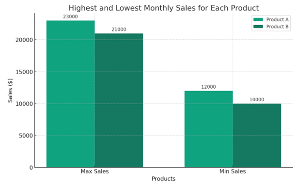
This visual comparison can quickly convey which products have the most variation in sales and the overall range of sales figures for each product.
#6 Focus on short-term trends.
Use a clustered column chart to focus on short-term trends, particularly when comparing multiple data series over a short period, like days or weeks.
For example, if you’re analysing weekly sales data across different store locations, a clustered column chart can visually represent each store’s weekly sales.
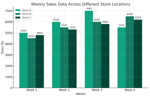
This setup makes it easy to identify any short-term trends or anomalies, such as a sudden spike or drop in sales at a particular location.
#7 The order of categories is not important.
Use a clustered column chart when the order of categories is not important to the interpretation of the data.
This chart type emphasises comparing different categories or groups rather than the sequence or progression of data points.
For example, suppose you’re comparing the performance of different departments within a company, such as sales, marketing, and finance.
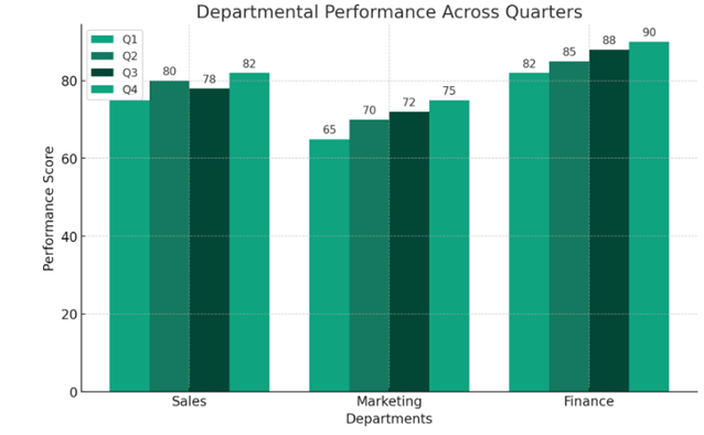
In that case, the order in which these departments are listed on the chart doesn’t affect the interpretation of the data.
Each department’s performance is displayed independently of the others, allowing for easy comparison without implying any sequential relationship.
#8 Comparing subcategories within a main category.
If you have data broken down into subcategories within a larger category, a clustered column chart can effectively compare these subgroups side by side.
A clustered column chart is particularly useful for comparing data broken down into subcategories within a larger category.
This type of chart allows you to display each subgroup side by side within the larger category, making it easy to compare the subgroups.
For example, imagine you have sales data for a clothing store categorised by seasons (Spring, Summer, Fall, Winter).
Within each season, you have subcategories like Men’s Wear, Women’s Wear, and Children’s Wear.
A clustered column chart can effectively display this data, showing each clothing type’s sales side by side for each season.
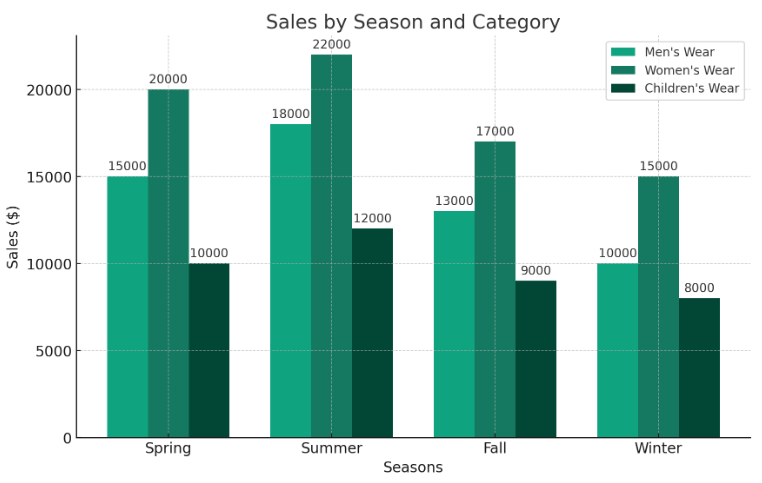
This layout helps quickly compare how different types of clothing perform in each season.
#9 Visualizing part-to-whole relationships.
When you want to show how different parts contribute to the whole in multiple categories, clustered column charts can display this effectively, especially if each category has the same parts or subcategories.
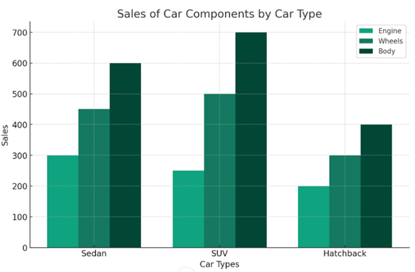
The clustered column chart above shows how the different parts (Engine, Wheels, and Body) contribute to total sales across car categories (Sedan, SUV, Hatchback).
Each group of bars represents a car type, with individual bars showing the sales of each component for that type.
This layout makes it easy to compare how different components contribute to sales for each car type.
For example, you can quickly see which components are more popular in Sedans versus SUVs or Hatchbacks.
This type of chart is particularly useful in manufacturing and sales analysis, providing insights into which parts drive sales in different market segments.
#10 Evaluating performance across different groups.
Clustered column charts are excellent for comparing performance metrics across groups or segments, such as sales by region or customer segment.
#11 Presenting survey results.
Clustered column charts are good for presenting survey data, especially where respondents are divided into different demographic groups, and you want to compare responses to the same questions across these groups.
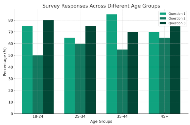
The clustered column chart above presents survey responses across different demographic age groups (18-24, 25-34, 35-44, 45+).
Each group of bars represents an age group, and individual bars show the percentage of responses to three survey questions.
This chart format makes it easy to compare responses to each question across age groups.
For example, you can quickly see how the responses to Question 1 vary between the youngest and oldest age groups or how the opinions on Questions 2 and 3 differ across all groups.
This type of visualisation is particularly useful in survey analysis, where comparing responses across different demographic segments can provide valuable insights into the preferences and opinions of different age groups.
Breaking a clustered column chart.
The chart below contains 11 data series and is very difficult to read and understand:
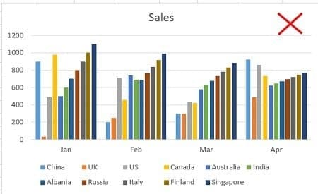
One way to make this chart easier to read and understand is to break it into several smaller clustered column charts.
For example, you can create a column chart that compares the sales performance of various countries in January.
Create another column chart which just compares the sales performance of various countries in Feb and so on:
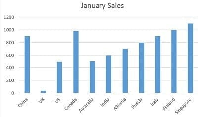
The rule of thumb is to avoid presenting too much data in one chart, regardless of the chart type.
Combination chart.
A combination chart is simply a combination of two or more charts.
For example, the combination of a column chart and a line chart.
I use combination charts a lot, and I think you must know how to create them as they are very useful.
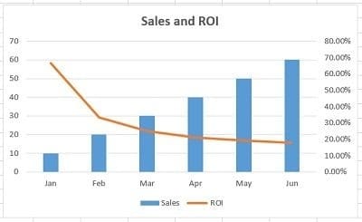
#1 Use a combination chart when you want to compare two or more data series that have different units of measurement:
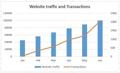
#2 Use a combination chart when you want to compare two or more data series that are not of comparable sizes:
#3 Use a combination chart when you want to display different types of data in different ways that can be represented in the same chart.
For example, line, bar and column charts can be used on the same chart.
Stacked column chart.
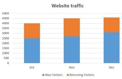
Use a stacked column chart when you want to compare data series along with their composition, and the overall size of each data series is important:
100% stacked column chart.
Use a 100% stacked column chart when you want to compare data series along with their composition, but the overall size of each data series is not important:
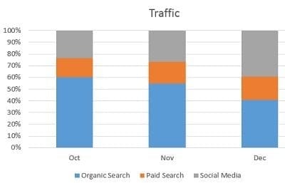
This chart shows the percentage of multiple data series in stacked columns.
Stacked area chart.
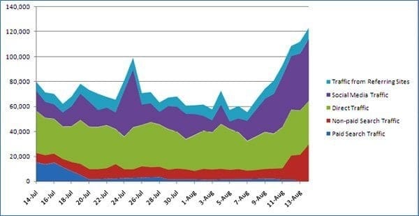
Use a stacked area chart when you want to show the trend of composition and emphasise the magnitude of change over time.
For example, the following stacked area chart shows the breakdown of website traffic:
Bar chart.
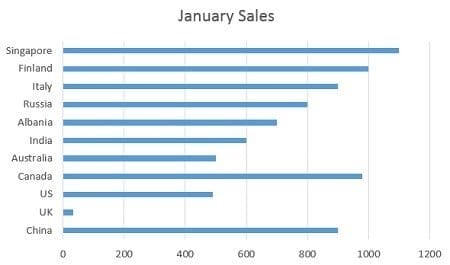
Use a bar chart whenever the axis labels are too long to fit in a column chart:
What are the different types of bar charts?
Horizontal bar charts – Represent the data horizontally. The data categories are shown on the vertical axis, and the data values on the horizontal axis.
Vertical bar charts – also called column charts. It represents the numerical values represented in the vertical bars. These are mainly used to display age and salary ranges.
Grouped bar charts – Grouped bar charts represent the different time period numbers that belong to a single category.
Stacked bar charts – It is a bar chart that represents the comparisons between categories of data but with the ability to compare and break down the data.
Pie Chart.
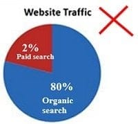
#1 Use a pie chart to show a 100% composition of data. In other words, the various pie slices you use must add up to 100%.
This means do not create a pie chart where the various pie slices do not represent parts of the whole pie.
For example, the following pie chart is not a good representation of data composition, as the two pie slices add up to 82% and not 100%:
#2 Use a pie chart to show the composition of data only when you have one data series and fewer than five categories to plot.
For example, the following pie chart shows the breakdown of website traffic sources in the last month:
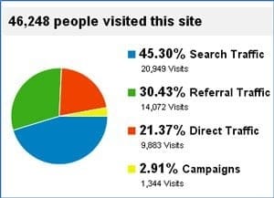
Here, I have only four categories (search traffic, referral traffic, direct traffic, and campaigns) to plot.
So a pie chart is ideal for showing the breakdown.
However, if there were more than four categories to plot, such as eight or ten, the pie chart would have become cluttered and hard to read.
For example, the following pie chart looks cluttered because it has too many categories:
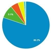
#3 Pie charts generally express the part-to-whole relationship in your data.
When your data is represented in ‘percentage’ or ‘part of’, then a pie chart best meets your needs.
#4 Use a pie chart to show data composition only when the pie slices are of comparable sizes.
In other words, do not use a pie chart if the size of one pie slice completely dwarfs the size of the other pie slice(s):
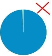
#5 Order your pie slices so that, as you look clockwise from top to bottom, the largest pie slice comes first, followed by the second-largest, and so on.
This makes the pie chart easy to read:
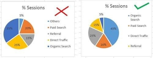
These pie charts are made from the following data:
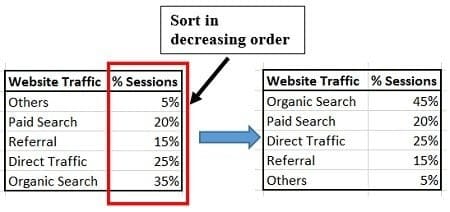
To create a pie chart where the biggest pie slice comes first, followed by the second biggest pie slice and so on.
I have sorted the data in decreasing order (from largest to smallest).
Best practices for using pie charts.
Limit the number of pie slices
Always use the fewest possible slices when creating a pie chart. It is really difficult to read a large number of slices.
If you have more than five categories, it is recommended to use a different chart type.
Make sure all data adds up to 100%
Verify that the pie slices add up to 100% when combined.
Include annotations: add percentages and labels to your pie chart to make it easier to read.
Pie charts work best for 25%, 50%, 75% and 100%.
Don’t compare multiple pie charts.
Do not use multiple pie charts for comparison, as the slice sizes are really difficult to compare side by side.
Number chart.
If you want to visualise just one type of data, and it contains a numeric value that does not fall in any range/interval, then use the number chart:

Gauge chart (Speedometer chart).
If you want to visualise just one type of data, and it contains a numeric value that falls in a range/interval, then use the gauge chart (also known as the speedometer chart):
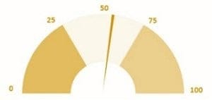
A gauge chart should be used to validate whether your data falls within the acceptable range.
A gauge chart typically shows the maximum value as the default and thresholds for low, medium, and high, indicating whether the data falls within the acceptable range.
Thresholds would be displayed in red, green and yellow for specified values.
Scatter chart.
#1 Consider using a scatter chart when you want to analyse and report the relationship/correlation between two variables:
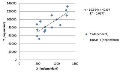
This chart shows that the relationship between the two variables (‘x’ and ‘y’) is linear. As the value of the variable ‘x’ increases, there is a corresponding increase in the value of the variable ‘y’.
#2 Create a scatter chart only when ten or more data points are on the horizontal axis. The more data points, the better it is for a scatter chart. Conversely, just a few data points (like 5 or 6) are not enough to create a scatter chart.
#3 Use a scatter chart when you want to show ‘why’. For example, why is revenue correlated with average order value, or why is conversion rate correlated with the number of transactions?
Histogram.
Use a histogram to show frequency distribution for quantitative data.
A histogram represents the visual representation of numerical data that falls within a specified range of values called ‘bins’.
It looks exactly like a vertical graph.
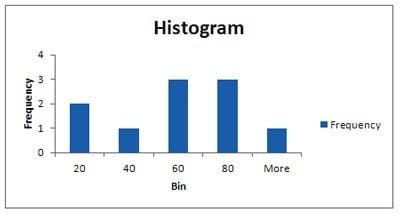
Note: You would need to install the ‘Analysis ToolPak’ to create a histogram in Excel.
Actual vs target chart.
The ‘Actual vs target’ chart is a combination chart that requires some formatting.
You can’t insert this chart straightaway into your Excel spreadsheet.
Use this chart when you have multiple goals and want to show progress toward each.
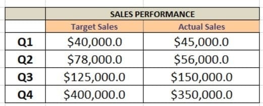
The chart below shows whether target sales were achieved in each quarter:
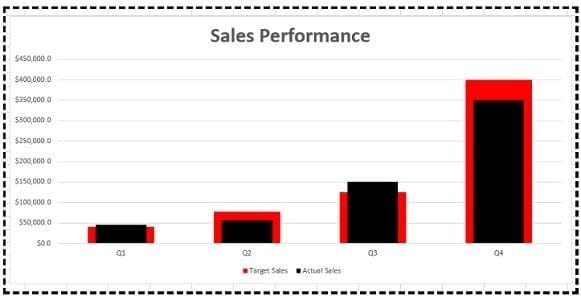
This chart is based on the following data table:
Bullet chart.
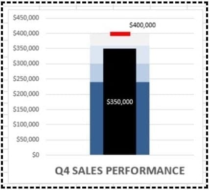
A Bullet chart is a combination chart (though it looks like a single bar chart), which is used to show progress towards a single goal using a range of predefined qualitative and quantitative parameters.
You can’t insert this chart straightaway into your Excel spreadsheet, and it is also quite tricky to create.
If you have multiple goals and you want to show progress towards each goal, then use the ‘Actual vs. target’ chart.
But if you have only one goal and want to show progress toward it (using both qualitative and quantitative data), use a bullet chart.
A bullet chart can be a vertical or horizontal bar chart. The choice between vertical and horizontal alignment depends on the space available for data visualisation.
The chart below shows the performance of sales in Quarter 4:
This chart is based on the following data table:
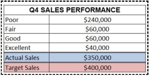
If the actual sales are between $0 to $240,000, then sales performance is considered ‘Poor’.
If the actual sales are between $240,000 to $300,000 ($240,000 + $60,000), then it is considered ‘Fair’.
If the actual sales are between $300,000 to $360,000 ($240,000 + $60,000 + $60,000), then it is considered ‘Good’.
If the actual sales are between $360,000 to $400,000 ($240,000 + $60,000 + $60,000 + $40,000,) then it is considered ‘Excellent’.
Funnel chart.
As the name suggests, the funnel chart is used for funnel visualisation. It is perfect for showing lead funnels and sales funnels.
Funnel charts visually represent the progressive reduction of data from one phase to another phase.
The first stage is often called the intake stage.
This chart is available in MS Excel (2016 and above). You just need to select your data table and then insert the ‘Funnel’ chart.
The chart below shows different stages of the purchase funnel and how users move from one stage to the next:
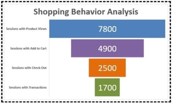
This chart is based on the following data table:

For example, let us take an ecommerce business.
Funnel charts can be used to understand how many users have added the products to the cart, provided shipping details and completed the purchase.
It also provides us with information about users who have abandoned their carts.
Funnel charts are primarily used in the sales process to identify potential problems.
A funnel consists of a higher value, called the head, and a lower part, called the neck.
Venn diagram.
Use a Venn diagram to show the overlap in the data.
The multi-channel conversion visualizer chart used in Google Analytics to visualise multi-channel attribution is a Venn diagram:
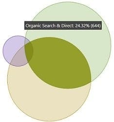
In web analytics, we can use a Venn diagram to determine whether or not a website has attribution problems.
If there is little to no overlap between two or more marketing channels, the website doesn’t have attribution issues.
If there is significant overlap, the website has attribution issues. You should seriously consider multi-channel attribution when analysing and interpreting the performance of marketing campaigns.
Another great use of Venn diagrams is in visualising the backlinks overlaps between websites:
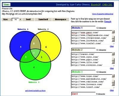
The tool I have used to create this Venn diagram is Venny.
Note: You can create a Venn diagram in Excel. Check out this tutorial on the Microsoft Office website: Create a Venn diagram.
What are the different types of Venn diagrams?
Two-set diagrams – Two circles with overlapping properties. This is the most common and simplest form of the Venn diagram used to compare two metrics or variables.
Three-set diagrams – This lets you visualise the relationship between three subjects rather than two variables.
Four-set diagram– This comprises four circles with overlapping properties. It is a bit more complex than the normal Venn diagram, and each circle represents a different aspect of the data and their comparison to other variables.
Sankey diagram.
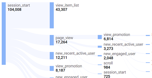
A Sankey diagram visualises the flow of data between different stages, groups or categories of a process through a series of connected nodes or paths.
Each node represents a stage, group, or category in the process, and each path represents the flow of data between them.
The width of each path is proportional to the amount of flow it represents.
So you can easily see which stages or categories are the most important or have the greatest impact on the overall process.
By visualising data flow, Sankey diagrams can help you understand a process's structure and identify areas for improvement to increase efficiency or effectiveness.
In the following cases, you can use a Sankey diagram:
#1 You want to show the flow of website visitors through different pages or sections of a website.
#2 You want to visualise the customers’ purchase journey.
#3 You want to identify patterns, trends, and areas of opportunity or concern in your customers’ purchase journey.
For example, you might notice that many customers drop off at the consideration stage, indicating you need to improve your marketing or product messaging to better engage potential customers.
In Excel, you can create Sankey diagrams using third-party add-ins or manually using Excel’s built-in charting tools.
Creating Sankey diagrams manually in Excel can be time-consuming and may not produce the most aesthetically pleasing or informative charts.
Using third-party add-ins can often provide more advanced features and flexibility in creating Sankey diagrams.
Some popular add-ins for creating Sankey diagrams in Excel include NodeXL and Tableau.
What type of chart to use to compare data in Excel?
One of the most frequently asked questions in the data visualisation world is, “What type of chart do I use to compare data in Excel?”
The following are the best chart types for comparing data in Excel:
- Column chart.
- Bar chart.
- Line chart.
- Combination chart.
When to use a column chart for comparing data?
If you want to compare two to four data series, then use a clustered column chart:
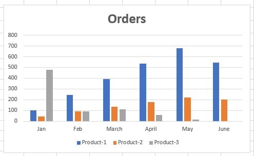
Alternatively, avoid creating a column chart with more than four data series.
For example, the following chart contains six data series, and it has started looking cluttered:
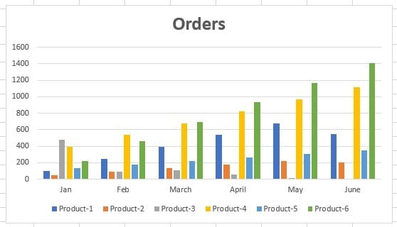
If you want to create a column chart with more than 4 data series, try switching the rows and columns of the chart and see if it makes a difference.
To do that, follow the steps below:
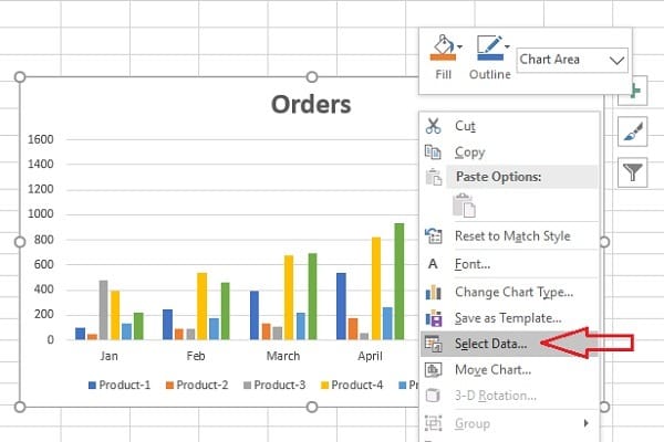
Step-1: Right-click on the column chart whose row and column you want to change.
Step-2: Click on ‘Select Data’ from the drop-down menu:
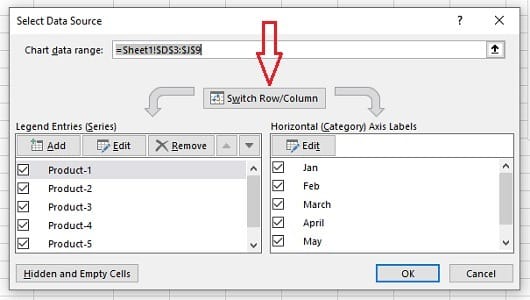
Step-3: Click on the ‘Switch/Row Column’ button:
Step-4: Click on the ‘OK’ button. The column chart will now look like the one below:
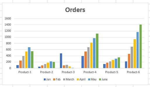
Now, this chart is much easier to read and understand.
Do not use a column chart when the data series you want to compare have different units of measurement
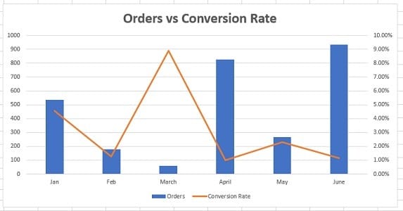
For example, in the chart below, ‘Orders’ and ‘Conversion Rate’ have different units of measurement.
The data series ‘Orders’ is of type number.
Whereas the data series ‘Conversion Rate’ is of type percentage:
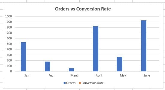
The best thing to do when the data series you want to compare have different units of measurement is to use the combination chart:

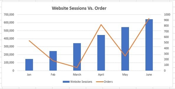
If the values of one data series dwarf the values of the other data series, then do not use the column chart to compare two data series.
For example, in the chart below, the values of the data series ‘Website Sessions’ completely dwarf the values of the data series named ‘Orders’:
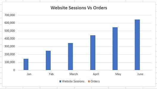
The best thing to do in such a situation is to use the combination chart:

If you want to compare data series along with their composition, then use a stacked column chart:
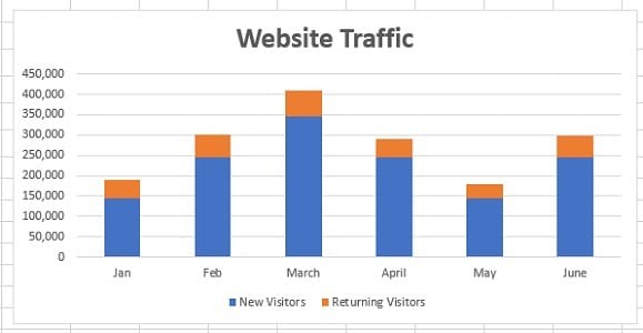
If you want to compare data series along with their composition, but the overall size of each data series is not important, then use a 100% stacked column chart:
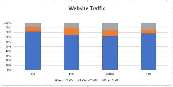
When to use a bar chart for comparing data?
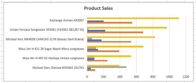
Use a bar chart when the axis labels are too long to fit nicely in a column chart:
When to use a line chart for comparing data?
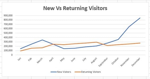
Use a line chart when you want to compare data trends, especially long-term trends between the values of the data series:
When to use a combination chart for comparing data?
A combination chart is a combination of two or more charts. For example, the combination of a column chart and a line chart.
Use a combination chart when:
#1 You want to compare two or more data series that have different units of measurement:
#2 You want to compare two or more data series that are not of comparable sizes:
Which charts should be avoided for reporting purposes?
Throughout this article, I have talked about the charts that should be used.
However, some charts should be avoided for reporting unless your target audience is as data-savvy as you.
The following are those charts:
#1 Charts to avoid > Treemap.

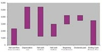
#2 Charts to avoid > Waterfall chart.
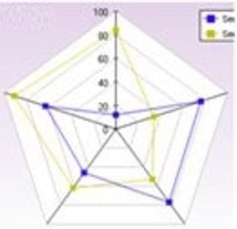
#3 Charts to avoid > Radar chart.
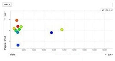
#4 Charts to avoid > Bubble chart.
The reason you should avoid reporting data to your clients via these charts is simple.
Most people have no idea what you are trying to communicate via these charts.
Use these charts only when your target audience is as data-savvy as you.
How to change the chart type in Excel?
MS Excel allows you to change the chart type.
For example, you can convert a clustered column chart into a stacked column chart. Or you can convert a column chart into a bar chart.
For example, let’s convert the following column chart into a bar chart:

Follow the steps below to change the chart type in Excel:
Step-1: Open MS Excel and navigate to the spreadsheet which contains the chart you want to edit.
Step-2: Select the chart, and then from the ”Design’ tab, click on the ‘Change Chart Type’ button:
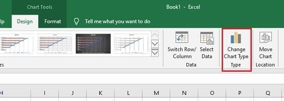
You will now see the ‘Change Chart Type’ dialogue box, like the one below:
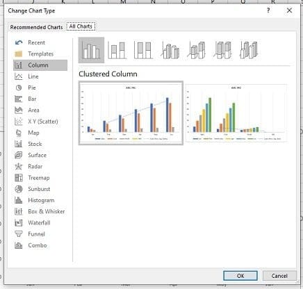
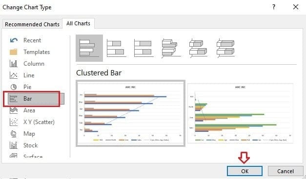
Step-3: Click on ‘Bar’ (from the left-hand navigation) and then click on the ‘OK’ button:
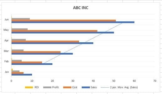
Excel will now change your column chart into a bar chart:
What is data visualization in Excel?
Data visualization is the presentation of data (both qualitative and quantitative data) in a graphical format.
In Excel, charts and graphs are used to visually represent data.
What are the benefits of data visualization?
Through data visualisation, you can easily:
- Visualise data (make sense of data, especially big data).
- Classify and categorise data.
- Find a relationship among the data.
- Understand the composition of data.
- Understand the distribution of data.
- Understand the overlapping of data.
- Determine patterns and trends.
- Detect outliers and other anomalies in data.
- Predict future trends.
- Tell meaningful and engaging stories to decision-makers.
Data presentation is a very important skill for an optimiser (marketer, analyst). In fact, it is so valuable that LinkedIn lists it as one of the top skills that can get you hired.
Excel charts are commonly used for data visualisation and presentation. But selecting the right Excel chart is always a challenge.
If you use the wrong Excel chart for your analysis, you may misinterpret the data and make the wrong business and marketing decisions.
If you use the wrong Excel chart in your presentation, stakeholders may misinterpret it and make the wrong decisions.
Therefore, selecting the right Excel chart is critically important.
What are the most common data types that can be visualized?
The following are the most common data types that can be visualized:
#1 Quantitative data (also known as interval/ratio data) is the data that can be measured. For example, ten customers, sales, ROI, weight, etc.
#2 Qualitative data can be classified/categorized but cannot be measured.For example, colours, satisfaction, rankings, etc.
#3 Discrete data – quantitative data with a finite number of values/observations.For example, five customers, 17 points, 12 steps, etc.
#4 Continuous data – quantitative data with value/observation within a range/interval.For example, sales in the last year.
#5 Nominal data – qualitative data that cannot be put into a meaningful order (i.e. ranked).For example, {Blue, Yellow, Green, Red, Black}.
#6 Ordinal data – qualitative data that can be put into a meaningful order (i.e. ranked).For example, {very satisfied, satisfied, unsatisfied, very unsatisfied} or {strong dislike, dislike, neutral, like, strong like}.
The anatomy of an Excel chart.
To read an Excel chart, you must understand the various components of the chart.
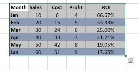
Consider the following data table in Excel:
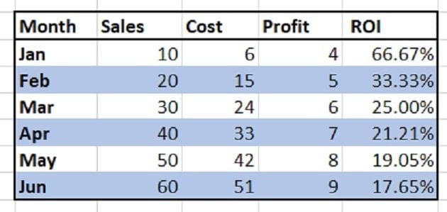
This data table has five variables: ‘Month’, ‘Sales’, ‘Cost’, ‘Profit’, and ‘ROI’:
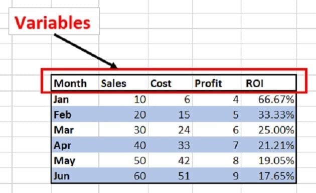
This data table is made up of categories and data series:
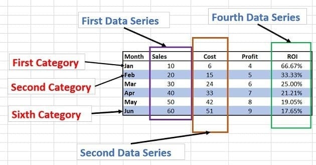
Categories – Here, the first category is ‘Jan’, the second category is ‘Feb’, the third category is ‘Mar’, etc.
Data series – A data series is a set of related data points.
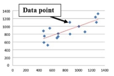
Data points – A data point represents an individual unit of data. 10, 20, 30, 40, etc., are examples of data points. In the context of charts, a data point represents a mark on a chart:
Consider the following Excel chart, which is made from the data table mentioned earlier:
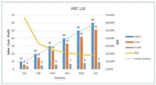
This chart is made up of the following chart elements:
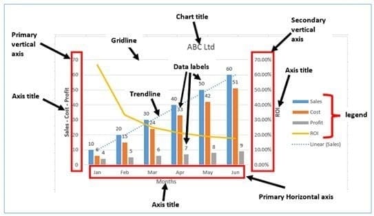
- Primary Horizontal Axis:
- Primary Vertical Axis
- Secondary Vertical Axis
- Primary Horizontal Axis Title
- Primary Vertical Axis Title
- Secondary Vertical Axis Title
- Chart Title
- Data Labels
- Gridlines
- Legend
- Trendline
In Excel, categories are plotted on the horizontal axis and data series are plotted on the vertical axis:
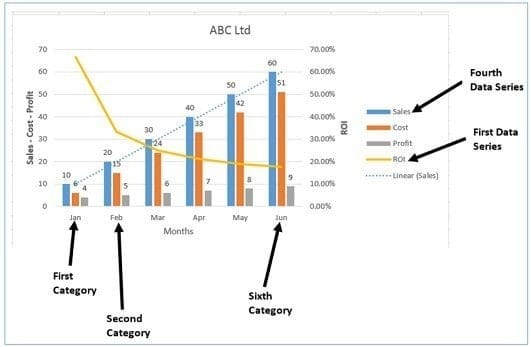
From the chart above, we can conclude the following:
- Months are plotted on the primary horizontal axis.
- Sales, cost, and profit are plotted on the primary vertical axis.
- ROI is plotted on the secondary vertical axis.
Following are examples of other Excel chart elements:
- Data Table with legend keys
- Data Table with no legend keys
- Error bars (Standard Error)
- Error bars (Percentage)
- Error bars (Standard Deviation)
- Primary Major Horizontal Gridlines
- Primary Major Vertical Gridlines
- Primary Minor Horizontal Gridlines
- Primary Minor Vertical Gridlines
- Linear Trendline
- Exponential Trendline
- Linear Forecast Trendline
- Moving Average Trendline
#1 Data table with legend keys.
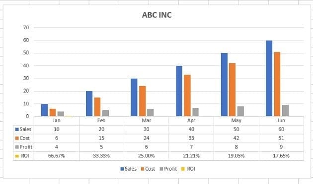
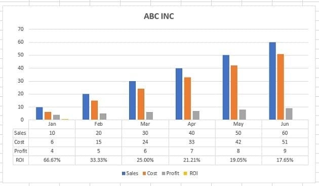
#2 Data table with no legend keys.
#3 Error bars (standard error).
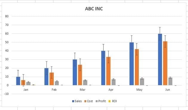
If you want to see the margin of error as a standard error amount, then use the standard error bar.
About Error Bar.
An error bar is a line through a point on a graph, parallel to one of the axes, which can help you see margins of error at a glance.
#4 Error bars (percentage).
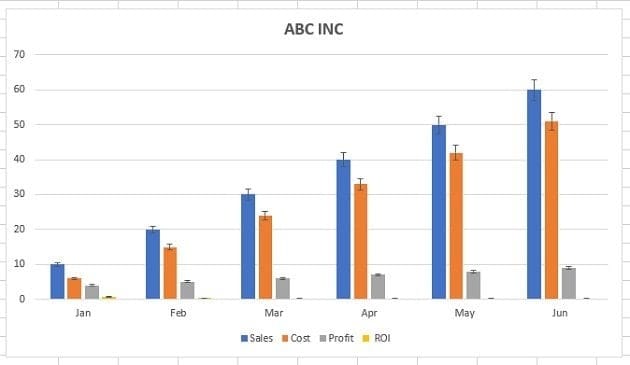
If you want to see the margin of error as a percentage, use the percentage error bar.
#5 Error bars (standard deviation).
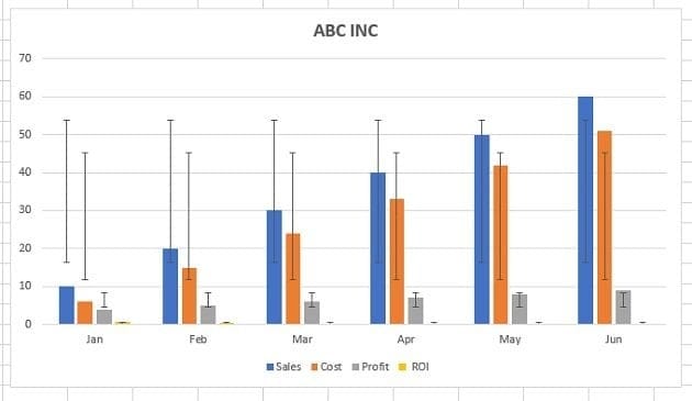
If you want to see the margin of error as a standard deviation, then use the standard deviation error bar.
#6 Primary major horizontal gridlines.
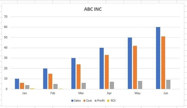
About Chart Gridlines.
Chart gridlines are the faint lines that appear in the chart's plot area. They are used to make the data in a chart easier to display on the axes. They can appear in both horizontal and vertical orientations.
#7 Primary major vertical gridlines.
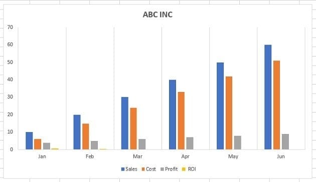
#8 Primary minor horizontal gridlines.
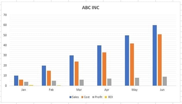
#9 Primary minor vertical gridlines.

#10 Linear trendline.
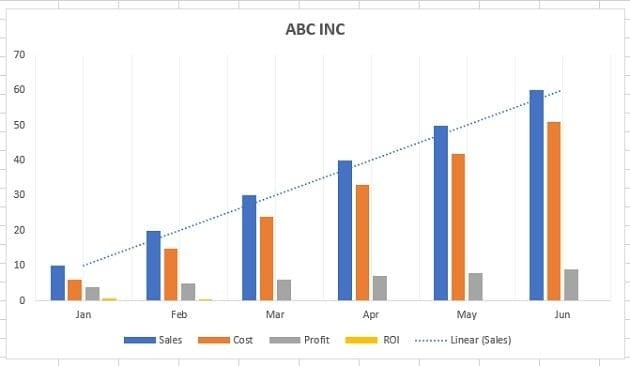
Use the Linear trendline if your data set is linear (resembles a straight line) and the data values increase or decrease at a steady rate.
About Trendlines.
The trendlines are used to graphically display trends in data. A trend is a movement in a particular direction.
A trend can be short-term (seasonal), intermediate, or long-term. The longer the trend more significant it is. For example, a 3-month trend is not as significant as 3 years trend.
#11 Exponential trendline.
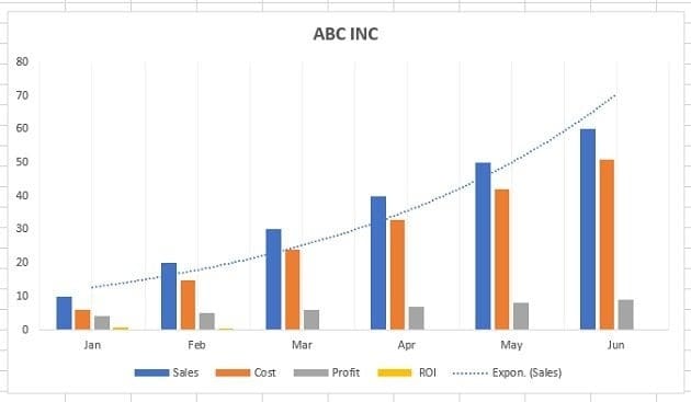
Use the exponential trendline if data values increase or decrease at increasingly higher rates.
#12 Linear forecast trendline.
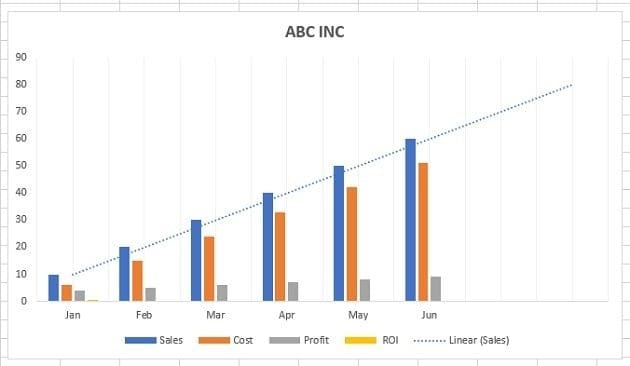
Use the Linear trendline if your data set is linear (resembles a straight line), the data values increase or decrease at a steady rate, and you want to forecast the data.
#13 Moving average trendline.
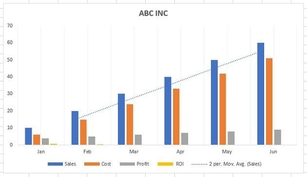
Use a moving average trendline if your data shows significant fluctuations.
How to add a chart to an Excel spreadsheet?
To add a chart to an Excel spreadsheet, follow the steps below:
Step-1: Open MS Excel and navigate to the spreadsheet containing the data table you want to use to create a chart.
Step-2: Select data for the chart:
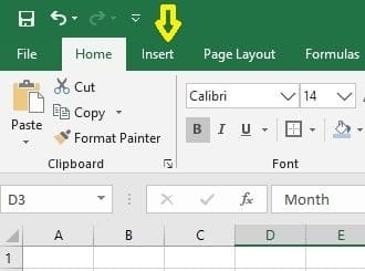
Step-3: Click on the ‘Insert’ tab:
Step-4: Click on the ‘Recommended Charts’ button:
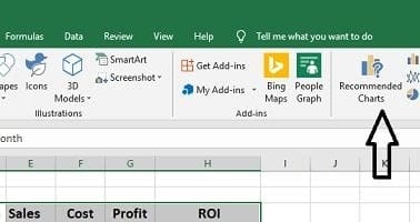
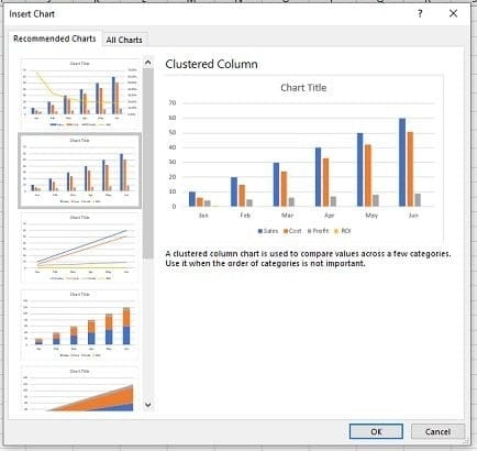
Step-5: Select the chart you want to use from the ‘Insert chart’ dialog box and then click on the ‘ok’ button:
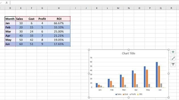
You should now be able to see the chosen chart inserted in your spreadsheet:
How to add, change, or remove a chart element in Excel?
To add, change or remove a chart element in Excel (2013 or above), follow the steps below:
Step-1: Open MS Excel and navigate to the spreadsheet which contains the chart you want to edit.
Step-2: Select the chart, and then from the ”Design’ tab, click on the ‘Add Chart Element‘ drop-down menu:
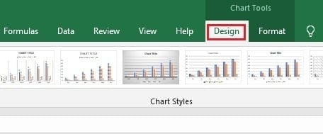
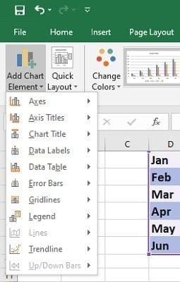
Step-3: Select the chart element you want to add, change or remove from one of the drop-down menus.
For example, if you want to add a data table to your chart, then click on ‘Data Table‘ > ‘With legend Keys‘:
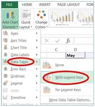
You can now see your chart along with the data table:
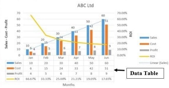
How to add a trendline to a chart in Excel?
Follow the steps below:
Step-1: Open MS Excel and navigate to the spreadsheet which contains the chart you want to edit.
Step-2: Select the chart, and then from the ”Design’ tab, click on the ‘Add Chart Element‘ drop-down menu.
Step-3: Click on the ‘Trendline’ drop-down menu and select the type of trendline you want to add to your chart.
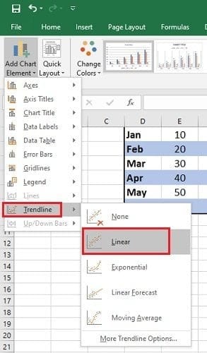
How to change the colour or style of a chart?
Step-1: Open MS Excel and navigate to the spreadsheet which contains the chart you want to edit.
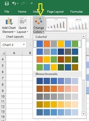
Step-2: Select the chart, and then from the ”Design’ tab, click on the ‘Change Colors‘ drop-down menu to change the colours used in your chart:
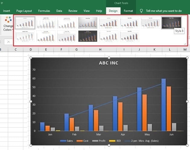
If you want to change the style/design of the chart, then click on one of the styles under the ‘Design’ tab:
How to build data visualizations in Excel?
You can build a data visualization in Excel through the following charts and graphs:
- Clustered column chart.
- Combination chart.
- Stacked column chart.
- 100% stacked column chart.
- Bar chart.
- Line chart.
- Number chart.
- Gauge chart (Speedometer chart).
- Pie chart.
- Stacked area chart.
- Venn diagram.
- Scatter chart.
- Histogram.
- Actual vs target chart.
- Bullet chart.
- Funnel chart.


