

Analysing data trends in Google Analytics is an age-old and powerful tactic used to measure the performance of marketing campaigns over time and predict future outcomes.
Following is an example of a data trend in Google Analytics:
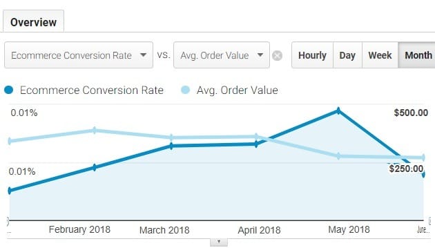
The screenshot above shows a trend for ‘ecommerce conversion rate‘ and ‘average order value’ between Jan 1 and June 30, 2018.
From the screenshot, we can conclude the following:
#1 The ‘ecommerce conversion rate’ went up between Jan and May 2018, and then there was a sharp decline.
#2 The ‘average order value’ has steadily declined since Feb 2018.
What is the advantage of doing trend analysis in Google Analytics?
We do trend analysis to measure the performance of a marketing channel, traffic source, campaign or metric over time.
We do trend analysis to get answers to questions like:
- Is the performance of a marketing channel, campaign, traffic source, metric, etc., improving or deteriorating over time?
- Are website sales growing over time or declining?
- Is the average order value improving or deteriorating over time?
- Where should I invest my money and resources to get the highest possible ROI?
- Which is the most effective marketing channel in terms of goal conversions and revenue?
In trend analysis, we spot a pattern(s), interpret it and then make predictions based on historical data.
How you analyse and interpret the ‘data trends’ plays a very important role in optimizing your marketing campaigns and making predictions about future outcomes.
One wrong interpretation and you can lose hundreds of thousands of dollars (depending upon the size of your business).
I am going to highlight a few key tips which I follow while analysing ‘data trends’ to get the highest possible ROI from my campaigns:
Tip #1: Always question how the data is collected
Before you analyse and interpret any data, always make sure that the data has been collected as accurately as possible esp. for the time period you have chosen to analyse.
Often wrong goals, incorrect goal values, incorrect ROI calculations, incorrect installation of tracking codes, etc., can corrupt the data.
Any decision made based on corrupted data could prove fatal for your marketing efforts and business.
If you are not sure how the data has been collected or can’t purge it, avoid taking major business decisions based on such data.
Collect fresh data and then wait for at least 3 months before you start analysing data trends.
Tip #2: Understand that historical data is in fact “dated”
The insight you get from analyzing historical data is often out of date, and it does not always match the present marketing conditions.
The older the data, the more unreliable it becomes. This is because we live and operate in a constant change of marketing conditions, trends, buying behavior, pricing, competition, and multi-channel funnels.
So comparing one year of web analytics data to the last year could be like comparing apples to oranges because so much would have changed during that time from website size, traffic, products, competitors to your target market.
As a rule of thumb,
Rule #1: The more you segment your data, the smaller should be your time frame for historical analysis.
Rule #2: The more you look at the data in an aggregate form, the bigger should be your time frame for historical analysis.
Related Article: What you should know about Historical Data in Web Analytics
Tip #3: Select the right time period to analyse your data trends
Get a deep understanding of your business and its cycle of ups and downs. Understand your businesses ‘sales cycle’.
Your business, just like any other business, tends to have natural ups and downs over the course of a year. We call these ups and downs seasonality.
We can never really understand this seasonality if we do not compare last year’s data with the present year data. This is one of the few situations where more than 1-year-old sales data becomes so important.
Use this understanding of seasonality to select the right time period.
As a rule of thumb:
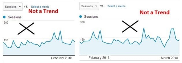
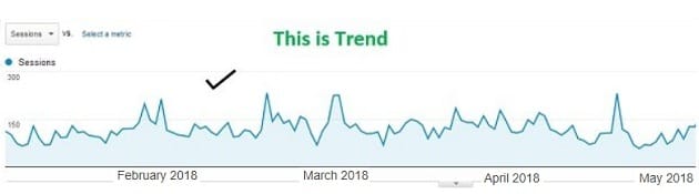
“ 1 week doesn’t make a data trend.
1 month doesn’t make a data trend.
Even 2 months don’t make a data trend.
3 or more months make a data trend. “
Tip #4: Add comparison to your data trends
Comparison adds ‘context’ to data and makes it more meaningful.
For example, you better understand a marketing campaign when you compare its performance with past performance using two different date ranges.
Only through comparison can you find out whether you are making progress or regress over time.
For example, look at the following last 7 days report on Google Analytics Sessions:
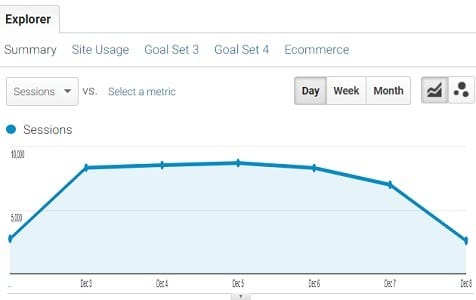
What insight do you get from this report?
Can you determine whether the website traffic has increased or decreased in comparison to last week? …. No, you can’t.
Can you conclude whether the decline in website traffic from Mon to Sat is normal?………No, you can’t.
For that, you need to compare this data with last week data:
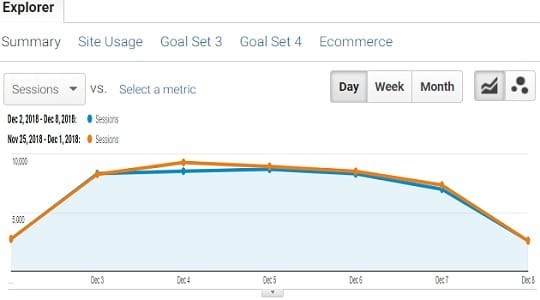
After looking at the report above, we can conclude that traffic has dropped a bit compared to last week, and it is normal for the website traffic to decline as we approach the weekend.
You can’t get such types of insight without comparing data trends.
Tip #5: Never report standalone metric in your data trends
A standalone metric does not have any context associated with it. So when you report standalone metrics, it is hard to figure out why things are going good or bad.
For example, in the report below, the only metric we see is ‘Revenue’:
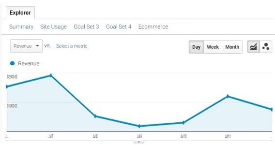
We have got no idea why the revenue declined so drastically in the middle of the week. To determine that, we need to add at least one more metric to the data trend.
This additional metric will add context to our data trend and provide insights that won’t be visible otherwise:
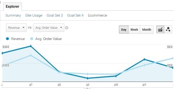
From the report above, we can conclude that one of the reasons for a drastic drop in revenue is the drastic drop in average order value.
You won’t get such insight if you report only a single metric in your data trend.
Related Article: Common Google Universal Analytics Mistakes that kill your Analysis & Conversions
Tip #6: Segment your data before you analyze/report data trends
Ask any web analyst who is worth his salt about which is the most important task in web analytics, and he will tell you straight away that it is “data segmentation”.
Segmentation adds context to the data and improves the measurement, and makes the data more actionable.
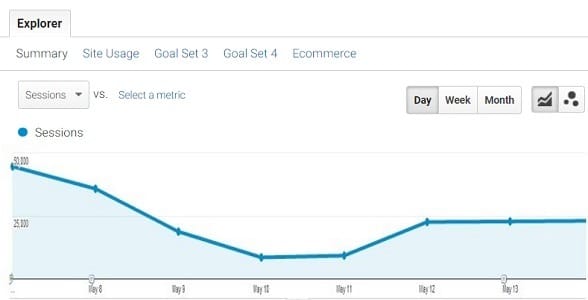
For example, in the report below, we have no idea why the overall website traffic went down:
You would need to segment this data trend into its individual components to get a better insight:
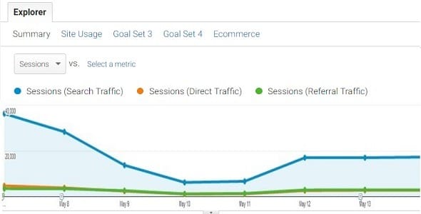
After segmenting the data trend into its individual components, we can conclude that the overall website traffic declined mainly due to a decline in search traffic.
By segmenting this data trend further, we can figure out the role of organic and paid search in the decline of the overall search traffic.
Tip #7: Look at a trend line with a lot of data points
A trend line is made up of data points.
A data point represents an individual unit of data. 10, 20, 30, 40, etc., are examples of data points.
In the context of charts, a data point represents a mark on a chart.
When you look at a trend line with very few data points like, say, two or three, the trend can be misleading. For example, the last three-month report below shows two trend lines with only three data points (as the time period is set to month):
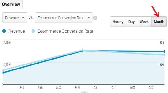
Now, if we look at the same report by week, the trend lines will include 12 data points each:
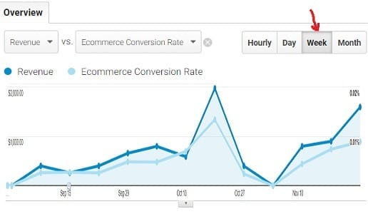
Note the big difference between the two trends.
You now get a better insight. You can now see a big dip between Oct and Nov… This dip was hidden before.
Now, if we look at the same report by day, the trend lines will include a lot more data points, and the trend may look completely different:
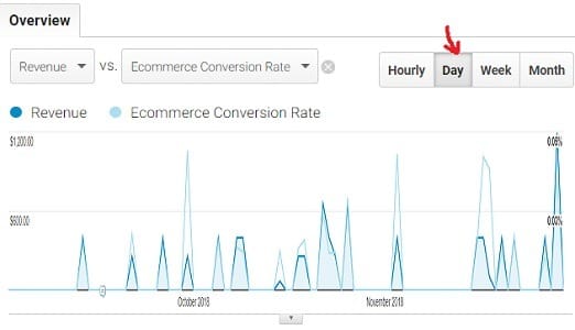
You can now see that there are certain days where there were no website sales.
Now, if we look at the same report by the hour, the trend lines will include the most data points, and the trend may look completely different:
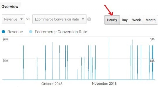
As a rule of thumb:
Rule #1: The more data points you include in your trend line, the smaller should be your time frame for trend analysis.
Rule #2: The less data points you include in your trend line, the bigger should be your time frame for trend analysis.
But these are not hard and fast rules. The number of data points you include in your trend line depends upon the insight you are after.
Tip #8: Report something business bottom line impacting
Does it really matter that ‘sessions with social referrals’ are going up?
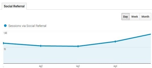
Similarly, does it really matter that Facebook likes are increasing over time or Twitter followers are increasing over time? The answer is ‘no’.
It does not really matter, not unless you tie these metrics with conversions.
That is because social engagement can be for all the wrong reasons:
- Maybe you are engaging with random people who are not really your target audience.
- Maybe you are engaging with your competitors.
If this is not the case, then your conversions must increase along with ‘sessions with social referrals’ over time, and you must be able to prove it.
Unless you don’t tie your metrics with conversions/transactions, you will not be able to report something that is business bottom line impacting.
Something which can convince your client/boss to invest more money in your marketing campaigns.
Top #9: Spell out the insight
What you can really understand from the chart below:
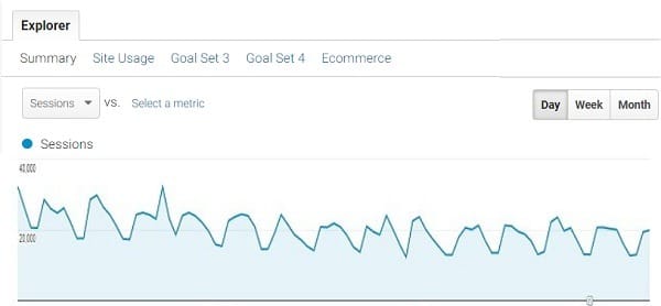
For an average person, the lines are going up and down. So what?
Unless you are creating reports for yourself, you need to add context to them. You can add context through: ‘comparison’, ‘use of two or more metrics’ and ‘data segmentation’.
You can also add context through annotations, graphic elements (like arrows), and written commentary. By commentary, I mean the story that the data trend is really telling you.
Write at least 4 or 5 lines that describe what is going on in plain English. Show how the trend is impacting the business bottom line in monetary terms.
You need to explain the reason for big spikes and deep trough in your data trends whenever you present it to the senior management/client.
Related Post: How to become Champion in Data Reporting
Tip #10: Do not jump to conclusions
While doing trend analysis, it is very important to keep in mind that the data you are looking at is “dated”.
You live in a constant change of marketing conditions, trends, buying behavior, pricing, competition and multi-channel funnels.
History does not repeat itself in online marketing.
It is highly unlikely that you can replicate your success rate by carrying out the exact same tasks you executed some six months ago with a particular campaign.
A major Google update or the arrival of a new and powerful competitor can easily screw the predictions you have made about your outcomes based on trend analysis.
So you may need to keep several external factors in mind while drawing conclusions from your data trends and not just the metrics you are analyzing in your trends.
Bonus Tip: Use Sparklines
Sparkline is a feature added in Microsoft Excel 2010 and beyond.
It is a tiny chart embedded in a cell:
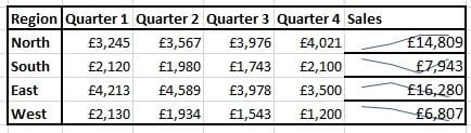
Through Sparklines, you can easily spot patterns in the data presented in a tabular format.
You can enter text in a cell and, at the same time, use a sparkline as its background. Any change in data of a cell immediately changes its sparkline.
Sparklines are another way of adding context to the data.
Click here to learn more about Sparklines.

Other Articles on GA4.
- Understanding Google Tag Manager Container Tag.
- Google Analytics Debugger, GTM Debugger Tutorial.
- Tracking web pages with zero pageviews in Google Analytics 4.
- How to Connect Google Analytics 4 with BigQuery.
- 100+ Google Analytics Remarketing Audiences for Retargeting.
- Google Tag Manager Workspaces Tutorial.
- Stop Trusting GA4/GTM Tag Coverage Report – Do This Instead.
- Some of your pages are not tagged in GTM/GA4 [Fixed].
- Tracking single page apps in Google Analytics via GTM.
- Anonymize IP in Google Analytics, gtag & Google Tag Manager.
- Matomo vs Google Analytics vs Piwik Pro - Best Google Analytics Alternative.
- Are You Waiting 12 Days Before Analyzing GA4 Data?
- Using Element Visibility Trigger in Google Tag Manager (GTM).
- Google Analytics Javascript Tutorial.
- Google Tag Manager Debugger Console Tutorial.
- Data Trend Analysis in Google Analytics.
- Facebook Pixel vs Google Analytics Data Discrepancies.
- Google Analytics 4 Model comparison report.
- 10 methods to fix (not set) Landing page issues in GA4.
- How to use the Conversion Paths report in GA4.